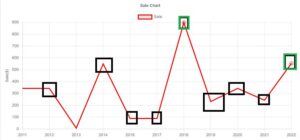
In this article, we are going to talk about another special feature of Chart Js, Let’s say I want to hide some data points in the line chart as shown in the below image. I have explored everywhere on the internet but couldn’t find the appropriate solution to achieve this task. so I decided to write this article.
For achieving this task, change pointRadius to an array-like below
pointRadius: [0, 0, 0, 0, 0, 0, 5, 0, 0, 0, 5]0=hide datapoint, greater than zero means it shows the point.
Look below configuration
 data: {
                labels: xValues,
                datasets: [
                    {
                        label: 'Sale',
                        lineTension: 0,
                        borderColor: 'red',
                        data: [343, 343, 8, 550, 89, 89, 898, 232, 343, 243, 554],
                        pointRadius: [0, 0, 0, 0, 0, 0, 5, 0, 0, 0, 5]
                    }
                ]
            }
How to hide some points inside line graph Chart Js
<!DOCTYPE html>
<html>
<head>
    <title>ChartJS-Hide Points in Line Chart</title>
    <script src="https://cdn.jsdelivr.net/npm/[email protected]/dist/chart.min.js"></script>
</head>
<body>
    <div style="margin-left:5%;margin-right:5%">
        <canvas id="myLineChart" style="width:100%;max-width:100%"></canvas>
    </div>
    <script>
var xValues = [2011, 2012, 2013, 2014, 2016, 2017, 2018, 2019, 2020, 2021, 2022];
const MultiLinechartData = {
            type: "line",
            data: {
                labels: xValues,
                datasets: [
                    {
                        label: 'Sale',
                        lineTension: 0,
                        borderColor: 'red',
                        data: [343, 343, 8, 550, 89, 89, 898, 232, 343, 243, 554],
                        pointRadius: [0, 0, 0, 0, 0, 0, 5, 0, 0, 0, 5]
                    }
                ]
            },
            options: {
                plugins: {
                    title: {
                        display: true,
                        text: 'Sale Chart',
                    }
                },
                scales: {
                    x: {
                        display: true,
                        title: {
                            display: true,
                            text: 'Year'
                        }
                    },
                    y: {
                        display: true,
                        title: {
                            display: true,
                            text: 'Sale($)'
                        }
                    }
                }
            }
        };
new Chart("myLineChart", MultiLinechartData);
    </script>

</body>
</html>
Output Graph
*Thank you so much if you have a question please comment
data: This object holds the data that will be displayed on the chart.
labels: xValues: This specifies the labels for the x-axis, presumably defined elsewhere in the code.
datasets: An array containing one or more datasets to be plotted on the chart. In this case, there's only one dataset.
label: 'Sale': This sets the label for the dataset, indicating what the data represents (e.g., sales).
lineTension: 0: This parameter controls the curvature of the lines connecting the data points. Setting it to 0 means the lines will be straight.
borderColor: 'red': This sets the color of the line connecting the data points to red.
data: [...]: This array contains the actual data points to be plotted on the chart.
pointRadius: [...]: This array specifies the radius of each data point on the chart. Setting some values to 0 ensures that certain data points won't be displayed as dots (they will be invisible), while others have a non-zero radius, resulting in visible dots.
The above code configures a dataset for a Chart.js line chart, where only certain data points are visible as dots (defined by their non-zero radius), and no lines are drawn between those specific points.
So it creates some curves and we will do that by putting in the tension here. If we say tension 0.4, by default it is set on zero which means that we have these straight lines but once put on 0.4 it becomes far more elastic. Once we do that we have a nicer smooth line with more elasticity. Next what I want to do is I want to increase the thickness of here border.
This thickness should be done about three pixels. All right, so now we have this. How do we remove these points items here? So basically these point items are based on the point radius. So all we have to do here is put a comma it’s a point radius and I’m going to indicate here zero pixels.
It would indicate that the radius or the circle radius will be equal to zero pixels. And by default, it’s probably like five to ten pixels. If I refresh now, you can see now our dots have been disappearing here and of course, we still have here what we call the hoovering effect here. We can remove this as well. To do this all you have to do is a comma and then we say Hoover coin radius.
Pay attention here to the capital P and the capital R. Same story here. Then we say here as well zero. Save that refresh. Now if you hook over it you might notice here we have hardly anything here and I guess the tooltip is there we are.
I do notice here something so I just have to check what it is. So I just quickly checked apparently I made a tiny mistake. Instead of Hoover point radius, it is point Hoover radius. Point Hoover radius still with capital H, capital R here. Also on zero.
Save that refresh and now if you go over it here you might see it here. Let’s see this is very tough. There we are. So we move over it. We don’t have any Hoover effect here on it.
But of course, it’s quite hard to pinpoint the exact dots or Pixel here where you have to Hover over and that’s basically here how you can make a smooth line here including the Hoover and removing the Hoover point radius as well.
Read Similar Articles
- [Solved]-Set,Delete and Read cookie value by name in JavaScript
- Create Stored Procedure with Return Values
- What is the power consumption of a Tv? | LCD/LED Energy Usage
- Mixer Grinder: Power Consumption and Wattage
- [Solved]-cannot construct instance of `org.springframework.web.multipart.multipartfile`
- [Solved]- Find Records From One Table Which Don’t Exist In Another SQL
- How to Create Stored Procedure with input parameters Step By Step