In this article, we'll cover how to make grouped and stacked charts in Chart.js. First off, it's important to know that you can indeed create grouped and stacked charts using Chart.js.
Stacked and Grouped Bar Chart Chart.js Example
The StackGroupbarChart is the variable that contains all the datasets and StackGroupbarChartOptions variable contains all the styling properties of the Stack Group barChart.
StackGroupbarChartOptions is an object with multiple properties used that would be required to display our data in the form of a Bar chart.
The labels property in StackGroupbarChart variable is an array that is used to assign the names to each bar, chart and the datasets property is also an array that contains information such as label title, bar backgroundColor, bar borderColor, borderWidth data.
<!DOCTYPE html>
<html>
<head>
    <title>Stacked & Group Bar Chart Using Chart.js </title>
    <script src="https://cdn.jsdelivr.net/npm/[email protected]/dist/chart.min.js"></script>
</head>
<body>
    <div style="margin-left:5%;margin-right:5%">
        <canvas id="StackGroupbarChartcanvas" style="width:100%;"></canvas>
    </div>
    <script>
var StackGroupbarChart = {
            labels: [
"2016",
"2017",
"2018",
"2019",
"2020",
"2021",
"2023",
"2022"
            ],
            datasets: [
                {
                    label: "App Developer",
                    backgroundColor: "pink",
                    borderColor: "pink",
                    borderWidth: 1,
                    data: [15, 22, 35, 86, 42, 62, 52, 58],
                      stack: 'Stack 0'
                },
                {
                    label: "Andriod Developer",
                    backgroundColor: "blue",
                    borderColor: "blue",
                    borderWidth: 1,
                    data: [48, 38, 39, 42, 42, 69, 39, 68],
                    stack: 'Stack 0'

                },
                {
                    label: "C# Developer",
                    backgroundColor: "green",
                    borderColor: "green",
                    borderWidth: 1,
                    data: [52, 29, 39, 68, 67, 66, 74, 77],
                    stack: 'Stack 1'
                },
                {
                    label: "Java Developer",
                    backgroundColor: "red",
                    borderColor: "red",
                    borderWidth: 1,
                    data: [52, 29, 39, 68, 67, 66, 74, 77],
                    stack: 'Stack 2'
                }
            ]
        };

var StackGroupbarChartOptions = {
            responsive: true,
            legend: {
                position: "top"
            },
            interaction: {
                intersect: false,
            },
            scales: {
                x: {
                    stacked: true,
                },
                y: {
                    stacked: true
                }
            },
            title: {
                display: true,
                text: "Chart.js Bar Chart"
            }
        }

        window.onload = function () {
var chartData = {
                type: "bar",
                data: StackGroupbarChart,
                options: StackGroupbarChartOptions
            }
new Chart("StackGroupbarChartcanvas", chartData);
        };

    </script>

</body>
</html>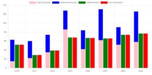
Code Editor
Code Explanation
As you can see in the above code we have three sets of data and each set has a number of developers belonging to a particular technology i. e App Developer, Andriod Developer, C# Developer, and Java Developer. now we want to create a ‘stack’ chart these using App Developer and Andriod Developer datasets and a ‘group’ bar chart using C# Developer and Java Developer dataset.
new Chart("StackGroupbarChartcanvas", chartData): Instantiates a new Chart.js chart on the canvas element with the id "StackGroupbarChartcanvas", using the configuration defined in the chartData object.
Above code will render a stacked and grouped bar chart on the webpage, displaying the data for different types of developers over the years, with bars grouped by stack categories.
Now what’s awesome about this is that this is HTML, this is responsive, it’s using canvas. There are eight different chart types and it’s totally open source. So I can’t imagine a reason why you wouldn’t want to use this project over some other charting solutions. Now there are things like D3, D3is an amazing package in the ecosystem. However, D3 is going to be overkill if you need a simple chart like one of these.
And these charts aren’t even that simple, to be honest. if you need a chart, you know, learning D3 is great. But if you need advanced visualizations, then D3 is probably going to be more up your alley. But if you’re just doing beautiful charts, check out chart js.
It’s awesome. Okay, so let’s head to documentation here. And as you can see, we have some pretty sweet docs. We have a line chart bar chart. And if you select the heading of any of these, it gives you not only just like an example, but a working example.
Now we also have pie and donut charts.Now a doughnut chart is just a sort of hipper way of showing a pie chart at this point it’s showing the exact same data but you see these used all over the place like Mint.com uses them and stuff like that and here we have scales which allows you to fully scale data whether it’s things like logarithmically and stuff like that.
But as you can see here, these are some of the best docs around so you can head to chartjs.org docs and just head in here and just see what’s available get inspired and in the next video we’re going to create our very first line chart right up top here and I’m going to talk a little bit about Chart JS while we go along so the other charts are a little easier once we get into them. Cool. So this is Chart JS. Hope you’re excited, we’re going to be building some really cool stuff.
Read Similar Articles
- [Simple Trick]-Set Different Color For Each Bar in a Bar Chart in ChartJS
- [Simple Trick]-Hide Points in ChartJS Line Graph
- [Simple Trick]-How to display Grouped Bar Chart Using Chart Js?
- [Simple Trick]-How to Hide Some Points in ChartJS
- How to leave just points without lines in ChartJS
- How to Create a Stacked Bar Chart Using Chart Js Example?
- [Simple Trick]-How to Combined Bar and line charts Using Chart.js?