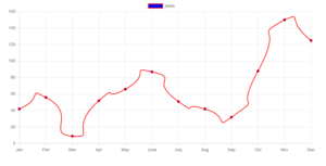
In this article, we'll talk about how to turn sharp lines into smooth curved lines using Chart.js. If you're new to Chart.js and want to change a graph to a smooth line chart, you're in the right spot.
By default, Chart.js gives you sharp lines, but we want to make them smooth curves instead.

we can easily achieve this task using the option lineTension that needs to be defined on the line chart dataset. set a value below 1.
lineTension: Bezier curve tension of the line. Set to 0 to draw straight lines. Source: Chart Js Documentation
Make Sharp Lines to Smooth Curved Lines
<!DOCTYPE html>
<html>
<head>
    <title>Set Different Color For Each Bar based on value Using chart.js</title>
    <script src="https://cdn.jsdelivr.net/npm/[email protected]/dist/chart.min.js"></script>
</head>
<body>
    <div style="margin-left:5%;margin-right:5%">
        <canvas id="linechart" style="width:80%"></canvas>
    </div>
    <script>
var LineChartData = {
            labels: [
"Jan",
"Feb",
"Mar",
"Apr",
"May",
"June",
"July",
"Aug",
"Sep",
"Oct",
"Nov",
"Dec"
            ],
            datasets: [
                {
                    label: "sales",
                    borderWidth: 2,
                    backgroundColor: "blue",
                    borderColor:"red",
                    lineTension: 1,
                    data: [42, 56, 9, 52, 66, 87, 51, 42, 32, 88,150,125]
                }
            ]
        };
const config = {
            type: 'line',
            data: LineChartData,
            options: {
                scales: {
                    y: {
                        beginAtZero: true
                    }
                }
            },
            title: {
                display: true,
                text: "Smooth curve line chart"
            }
        };

        window.onload = function () {
new Chart("linechart", config);
        };

    </script>

</body>
</html>
Chart.js.
var LineChartData = {...}: Defines an object that holds the data for the chart. It specifies the labels (months) and datasets, each representing a line on the chart.
labels: An array containing the labels for the x-axis (months).
datasets: An array of objects representing each line on the chart. Each object specifies the label, line color, data points, and other properties.
const config = {...}: Defines an object that holds the configuration options for the chart.
data: Contains the data for the chart.
options: Specifies additional configuration options for the chart, such as scales.
new Chart("linechart", config): Instantiates a new Chart.js chart on the canvas element with the id "linechart", using the configuration defined in the config object.
Above code create a line chart on the webpage, displaying the sales data for each month, with a smooth curve line.
Read Similar Articles
- [Simple Trick]-Create a Multi Line Chart Using Chart.js
- [Chart JS]- How to Make Sharp Lines to Smooth Curved Lines?
- [Simple Trick]-How to display Grouped Bar Chart Using Chart Js?
- [Simple Trick]- Stacked and Grouped Bar Chart Chart.js Example
- [Simple Trick]-Hide Points in ChartJS Line Graph
- [Chart Js]- Straight Lines and Curves Lines in the Same Graph
- [Simple Trick]-How to Hide Some Points in ChartJS
- [Simple Trick]-Set Different Color For Each Bar in a Bar Chart in ChartJS