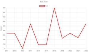
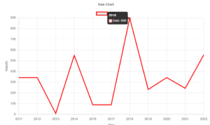
In this article, we're going to focus on creating a smooth line without points. As you can see, we've removed the points or dots on the line, but you can still hover over it. This results in a very nice smooth line. We'll enhance this line to make it more elastic, giving it a more curved appearance.

How can I remove the point dot in each data point in the line chart?
we can accomplish this task by using the point’s radius property of the chart js option in the configuration as below example:
elements: {
                    point:{
                        radius: 0
                    }
                }
Option configuration :
 options: {
                elements: {
                    point: {
                        radius: 0
                    }
                },
                plugins: {
                    title: {
                        display: true,
                        text: 'Sale Chart',
                    }
                },
                scales: {
                    x: {
                        display: true,
                        title: {
                            display: true,
                            text: 'Year'
                        }
                    },
                    y: {
                        display: true,
                        title: {
                            display: true,
                            text: 'Sale($)'
                        }
                    }
                }
            }
Hide points in line chart and show only tooltip
You can see here in the below image we have removed the dots in the line, but you can still Hover tooltip.

<!DOCTYPE html>
<html>
<head>
    <title>ChartJS-Hide Points in Line Chart</title>
    <script src="https://cdn.jsdelivr.net/npm/[email protected]/dist/chart.min.js"></script>
</head>
<body>
    <div style="margin-left:5%;margin-right:5%">
        <canvas id="myLineChart" style="width:100%;max-width:80%"></canvas>
    </div>
    <script>
var xValues = [2011, 2012, 2013, 2014, 2016, 2017, 2018, 2019, 2020, 2021, 2022];
const MultiLinechartData = {
            type: "line",
            data: {
                labels: xValues,
                datasets: [
                    {
                        label: 'Sale',
                        lineTension: 0,
                        borderColor: 'red',
                        data: [343, 343, 8, 550, 89, 89, 898, 232, 343, 243, 554]
                    }
                ]
            },
            options: {
                elements: {
                    point: {
                        radius: 0
                    }
                },
                plugins: {
                    title: {
                        display: true,
                        text: 'Sale Chart',
                    }
                },
                scales: {
                    x: {
                        display: true,
                        title: {
                            display: true,
                            text: 'Year'
                        }
                    },
                    y: {
                        display: true,
                        title: {
                            display: true,
                            text: 'Sale($)'
                        }
                    }
                }
            }
        };
new Chart("myLineChart", MultiLinechartData);
    </script>

</body>
</html>
*Thank you so much if you have a question please comment
And of course, we will change the thickness of the line so it’s nice and thick. So let’s start to look at how to do this in this video, we’re going to focus on one of the reader questions, which is how to remove the points or the dots in a line charging charges. So this question came from one of my other videos about how to add shadows to the line charging charges. And probably most likely you want to remove the dots from it. That’s a fair point.
So let me start to work on that and let’s start with how to do it. To do that, we do need to go to the charts .com Getting Started link to get the default code. And for some reason, I get this error here why? I do not know, but on Firefox, it works fine. However, let’s copy this chunk of code here because you basically need the code on this page.
And then what we’re going to do is we’re going to just paste it in here. Once we paste that in here, I’m going to remove that, put it in there, save this, and refresh. So now we have a nice bar chart, but we don’t want a bar chart. We want a line chart. So what we’re going to do is a few things.
We’re going to convert it into a line chart. So let’s search here. The type will be the line. Secondly, I want to change the color. If I save this right now, refresh, you can see we have multiple colors here.
And I don’t want this. I want just single color only. And eventually, it will not matter so much because we will not even have this kind of background color anyway. But just to be sure and to simplify, we’re just going to put only one single color here.
Once we save it and refresh it. Now we have a single color. The next thing I want to do is maybe to smooth out the line because right now we have these dots here, but also it’s not elastic. It’s a very tightened line which is just straight lines. And let’s make it more elastic.
 Read more article